
Color Theory for People Who Are Scared of Color (The 60-30-10 Rule)
How to stop your living room from looking like a sad beige explosion without needing an art degree.
Let’s be real. Standing in front of that massive wall of paint chips at the hardware store is terrifying. It’s not just paint; it’s an existential crisis grouped by satin, semi-gloss, and eggshell.
You went in for "white," and now you’re paralyzed by the choice between "Whispering Birch," "Cloudless Day," and "Vanilla Milkshake." (Spoiler alert: They look exactly the same until you put them on your wall, at which point one will inexplicably turn purple).
So, you panic. You paint everything "Greige." You buy a beige sofa. You add a cream rug. And suddenly, your living room looks like the waiting room of a dentist who doesn't believe in joy.
Friends, step away from the fifty shades of oatmeal. It’s time to learn the secret handshake of interior designers: The 60-30-10 Rule.
It sounds like math. I promise you, it’s not the kind of math that made you cry in high school. It’s the kind of math that helps you bake a perfect cake or assemble an outfit that doesn't look like you got dressed in the dark.
Here is your informative, slightly sassy guide to mastering color balance.
What in the Picasso is the 60-30-10 Rule?
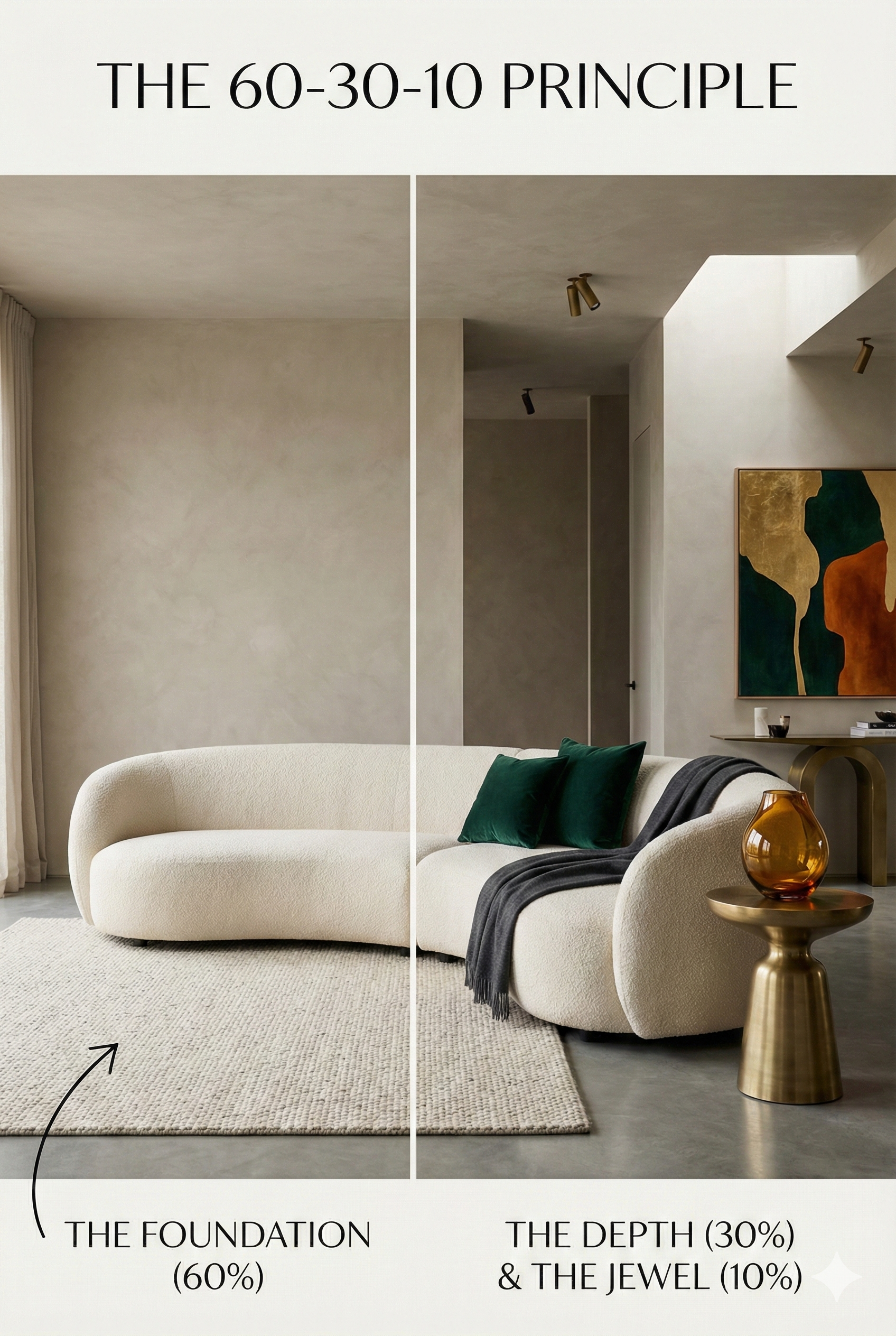
The 60-30-10 rule is a timeless decorating principle that helps you create a balanced color palette. It stops your room from looking like a chaotic circus, but it also prevents it from looking like a monotone padded cell.
Think of your room like a well-balanced diet, but way more fun because you can’t eat a sofa.
60% is your meat and potatoes.
30% is your vegetable side dish.
10% is the Sriracha sauce you drizzle over the top because you’re spicy like that.
Breaking Down the Percentages
You don’t need to get out a measuring tape and calculate the surface area of your throw pillows. These are loose guidelines.
The 60%: The Dominant Color (The "Responsible Adult")
This color does the heavy lifting. It sets the tone. It anchors the space. It’s the background noise that makes everything else sound good.
Where it goes: Walls, large area rugs, major furniture pieces (like that giant sectional).
The vibe: Usually, this is a neutral or a more muted shade. If you make your 60% "Electric Lime Green," your guests will need sunglasses to watch TV.
Think of it like: A good pair of jeans. They are the foundation of the outfit, but they aren't usually the thing people scream "OH MY GOD WHERE DID YOU GET THOSE" about.
The 30%: The Secondary Color (The "Supportive Best Friend")
This color needs to support the dominant color, but also be different enough to be interesting. It adds depth so your room doesn't look flat.
Where it goes: Curtains, painted furniture, accent chairs, bed linens, a smaller rug layered over the big one.
The vibe: It should hold its own against the 60%, but not start a fistfight with it.
Think of it like: A great blazer or jacket you wear with those jeans. It says, "Yes, I put effort into this."
The 10%: The Accent Color (The "Drama Queen")
This is where the magic happens. This is the sparkle. This is the flavor. This is the 10% that makes people think you hired a professional.
Where it goes: Throw pillows, art work, lamps, vases, weird little ceramic animals you bought on Etsy.
The vibe: Bold, punchy, or metallic. This is the color you’re terrified to paint a whole wall, but you love it in small doses. It’s low risk, high reward. If you hate it in six months, it’s easier to replace a pillow than repaint a room.
Think of it like: Red lipstick, cool sneakers, or chunky jewelry. It's the "pop."
Okay, But How Do I Actually Pick the Colors Without Crying?
Knowing the percentages is great, but how do you choose the actual colors? You have three main options, ranging from "safe" to "spicy."
1. The Monochromatic Look (The "I Play It Safe" Option)
How to do it: Pick one color (say, blue) and use three variations of intensity.
Example: 60% Navy, 30% Medium Blue, 10% Sky Blue.
Pro Tip: If you do this with neutrals (white/grey/black), you must vary the textures (think chunky knits, leather, velvet), otherwise your room will feel like an operating theater.
2. The Analogous Look (The "Harmonious Neighbor" Option)
How to do it: Pick three colors right next to each other on the color wheel. They naturally get along because they share DNA.
Example: 60% Teal, 30% Green, 10% Chartreuse. It feels organic and calming, like a very expensive spa.
3. The Complementary Look (The "Opposites Attract" Option)
How to do it: Pick two colors directly opposite each other on the color wheel for maximum drama.
Example: 60% Cool Grey (neutral foundation), 30% Navy Blue, 10% Burnt Orange. The orange will pop so hard against that blue your eyes will water with joy.
The Final Takeaway
The 60-30-10 rule isn't a law. The Design Police will not kick down your door if your accent color is actually 12%.
It’s a safety net. It gives you permission to buy that weird turquoise lamp because you know exactly where it fits in the grand scheme of things.
So go forth! Be brave! Buy something that isn't beige! Your living room deserves a little seasoning.
Alana Mathews 12/26/25
Don't Panic, It’s Just Math: Using the Golden Ratio for a Killer Bedroom Accent Wall
Hello, fellow design enthusiasts and victims of the "why does my room look weird" blues.
Let’s talk about your bedroom. Specifically, let's talk about that one wall you’ve been staring at, knowing it needs something, but fearing you’ll mess it up and end up with something that looks like a Pinterest fail meme.
You want modern. You want chic. You want a space that feels subconsciously soothing in a way you can't quite articulate.
Well, grab a glass of wine and perhaps an ibuprofen, because today we are diving into the terrifying world of mathematics.
Just kidding. We’re talking about the Golden Ratio. And I promise, no actual calculus is required.
What is this "Golden" Thing, Anyway?
If you took an art history class in college and actually stayed awake, you might remember the term. The Golden Ratio (often symbolized by the Greek letter Phi, φ, because Greeks make everything sound cooler) is approximately equal to 1.618.
“Great,” you say. “You promised no math. I am already bored.”
Stick with me! In plain English, the Golden Ratio is nature's cheat code for beauty. It’s a proportion found everywhere—from the swirl of a nautilus shell to the arrangement of petals on a rose, to apparently, Brad Pitt’s face.
Our brains are hardwired to love this ratio. When we see things arranged according to 1.618, our subconscious whispers, “Ahhh. That’s nice. Everything is right in the world.” When things are symmetrical and perfectly square? Our brains say, “Meh. A bit robotic, isn't it?”
We want your bedroom to whisper, not say "meh."
The Modern Bedroom Accent Wall: The Problem
Here is the issue with most DIY accent walls: We love symmetry too much.
We decide to do a two-tone painted wall, so we slap tape right across the middle. We hang art exactly centered over the bed. We buy two identical nightstands and two identical lamps and place them equidistant from the mattress.
It’s fine. It’s functional. But it’s also… a boring hotel room.
Modern design thrives on organized asymmetry. It likes tension. And that is where our friend 1.618 comes to the rescue.
How to Golden Ratio Your Wall (Without Crying)
Let's apply this ancient secret to a modern bedroom accent wall. We aren't building the Parthenon here; we just want a cool backdrop for your headboard.
Here are three ways to fake the math and get the look:
1. The Two-Tone Paint Job (The "Rule of Thirds-ish")
You want to paint the bottom half of your wall moody teal and leave the top white. Stop! Don't put that tape line in the middle.
The Golden Ratio suggests that splitting a space perfectly in half creates visual stagnation. Instead, we want to split it into roughly 1/3 and 2/3 sections (which is a very rough, lazy decorator's approximation of the Golden Ratio).
The Fix: Measure your ceiling height. Divide that number by 1.618. Example: If you have 9-foot ceilings (108 inches), 108 ÷ 1.618 = roughly 67 inches.
Place your paint line 67 inches up from the floor. You now have a larger bottom section and a smaller top section. It feels grounded, modern, and strangely satisfying.
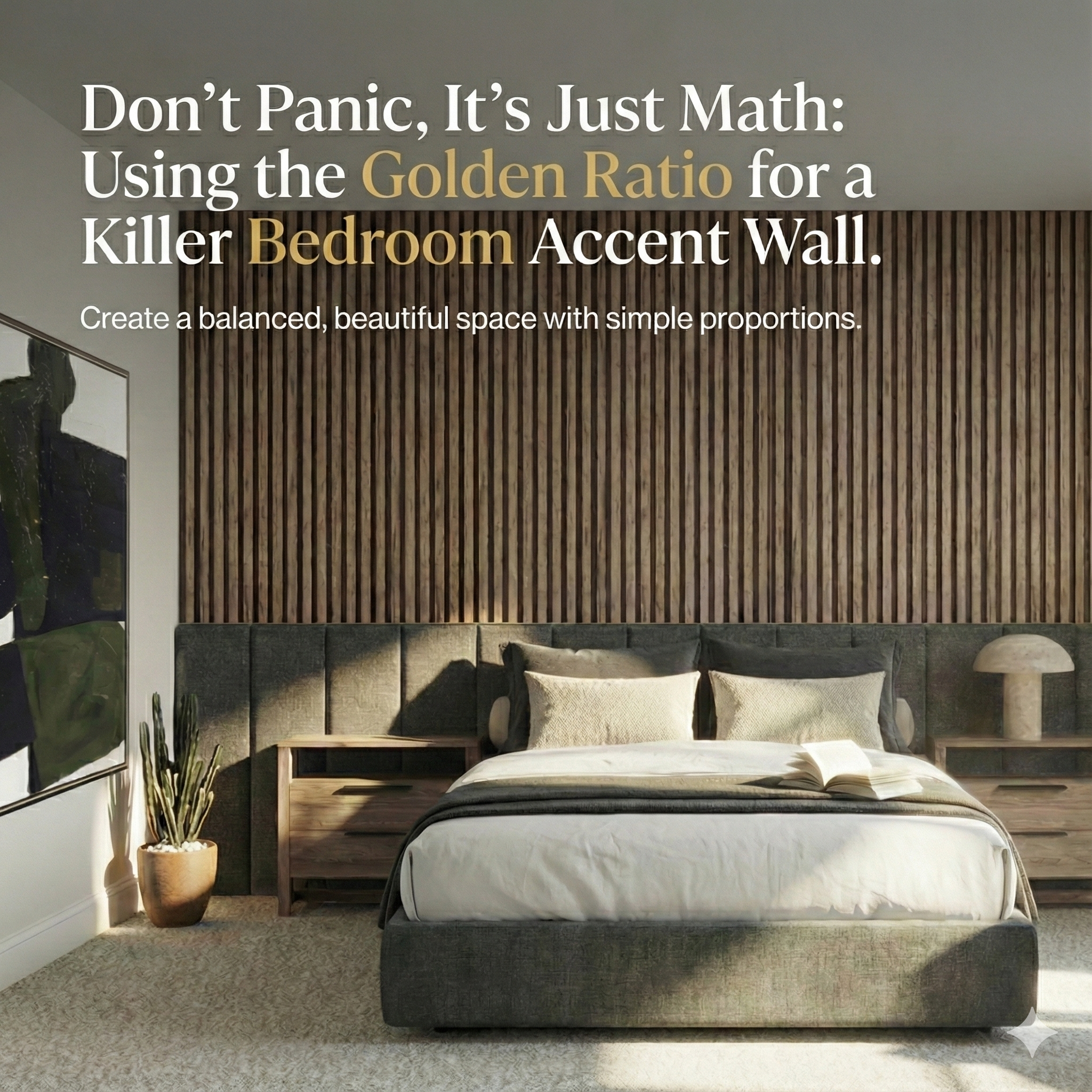
2. The Asymmetrical Wood Slat Wall
Vertical wood slats are terribly trendy right now. They add texture and warmth. But if you cover the entire wall behind your bed, it can start to look like a sauna.
We need an offset focus point.
The Fix: Instead of centering the slat feature behind the bed, shift it. Let’s say your wall is 12 feet wide. Don't put a 6-foot wide slat section right in the middle.
Apply the slats to roughly 2/3 of the wall, starting from one corner, and leave the remaining 1/3 as flat paint. Position your bed so the headboard overlaps the junction of the wood and the paint.
This works just as well on a horizontal layout. Make the bottom 1/3 an upholstered wall, while keeping the top 2/3 of the wall the wood slat feature.
It looks intentional, architectural, and expensive. It looks like you hired someone who knows what "Phi" is.
3. The Grid Wall (Board and Batten)
If you’re doing a modern grid using lattice strips or molding, your instinct will be to make perfect squares.
Resist the urge to make squares!
Squares are stable, but they aren't sexy. Rectangles based on the Golden Ratio are where the magic happens.
The Fix: When planning your grid, try to make your rectangles so that the longer side is roughly 1.6 times longer than the shorter side. They don't have to be perfect—we aren't launching rockets here—but aim for "clearly a rectangle" rather than "almost a square."
When you look at the finished wall, it won't look like graph paper; it will look like a sophisticated architectural feature.
The Takeaway
Look, you don't need to walk around your house with a caliper measuring your coffee table. The point of the Golden Ratio in decorating is just to shake you out of the "everything must be centered and symmetrical" mindset.
Embrace the off-center. Embrace the unequal split. Trust that the weird little 1.618 number knows what your brain wants better than you do.
Now, go forth and tape that wall unequally. Apologize to your high school math teacher later.
Alana Mathews 12/26/25